-

Want a paper copy?
You can now buy the book!
All royalties go to the Cystic Fibrosis Trust.Spotted an error? Have comments?
Let us know!Get hands on with source code for the book.
4.5 Evaluating and improving the feature set
Using our newly-completed model and feature set, we can train a personalised classifier for each user in our data set. To be precise, for each user’s training set, we compute the active feature buckets featureIndices for each email, along with their feature values featureValue. Given these observed variables, we can then apply expectation propagation to learn a posterior weight distribution for each bucket, along with a single posterior distribution over the value of the threshold. But first we need to look at how to schedule message passing for our model.
Parallel and sequential schedules
In this optional section, we look at how to schedule the expectation propagation messages for our model. If you want to go straight to look at the results of running expectation propagation, feel free to skip this section.
When running expectation propagation in this model, it is important to choose a good message-passing schedule. In this kind of model, a poor schedule can easily cause the message-passing algorithm to fail to converge or to converge very slowly. When you have a model with repeated structures (such as our classification model), there are two main kinds of message-passing schedule that can be used: sequential or parallel. To understand these two kinds of schedule, let’s look at message passing on a simplified form of our model with two features and two weights:
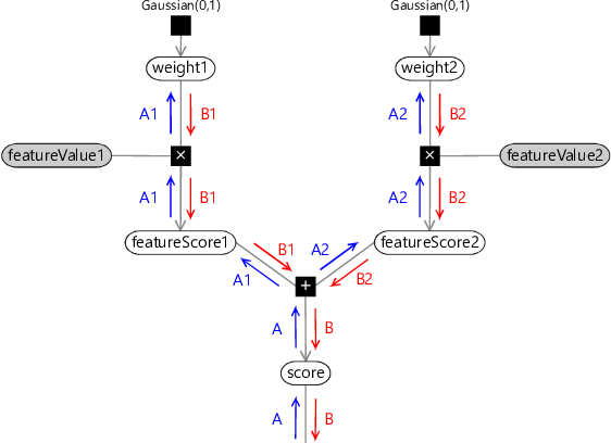
In this figure, rather than using a plate across the buckets, we have instead duplicated the part of the model for each weight. When doing message passing in this model, two choices of schedule are:
- A sequential schedule which processes the two weights in turn. For the first weight, this schedule passes messages in the order A, A1, B1, B. After processing this weight, message-passing happens in the bottom piece of the graph (not shown). The schedule then moves on to the second weight, passing messages in the order A, A2, B2, B.
- A parallel schedule which processes the two weights at once. In this schedule, first the messages marked A are passed. Then both sets of messages (A1 and B1) and (A2 and B2) are passed, where the messages from the plus factor are computed using the previous B1 and B2 messages. Finally, the message marked B are passed.
To see the difference between the two schedules, look at how the first A2 message coming out of the plus factor is calculated. In the sequential schedule, it is calculated using the B1 message that has just been updated in this iteration of the schedule. In the parallel schedule, it uses the B1 message calculated in the previous iteration, in other words, an older version of the message. As a result, the parallel schedule converges more slowly than the sequential schedule and is also more likely to fail to converge at all. So why would we ever want to use a parallel schedule? The main reason is if you want to distribute your inference computation in parallel across a number of machines in order to speed it up. In this case, the best option is to use a combined schedule which is sequential on the section of model processed within each machine but which is parallel across machines.
Visualising the learned weights
To ensure this sequential schedule is working well, we can visualise the learned weight distributions to check that they match up to our expectations. Figure 4.13 shows the learned Gaussian distributions over the weights for each feature bucket for User35CB8E5 (to save space, only the fifteen most frequent Sender weights are shown).
 Excel
Excel CSV
CSV
Looking at each weight in turn, we can see that more positive weights generally correspond to those feature buckets that we would expect to have a higher probability of reply, given the histograms in the previous section. For example, looking at the SubjectLength histogram of Figure 4.12c, you can see that the positive and negative learned weights correspond to the peaks and troughs of the histogram. You can also see that the error bars are narrower for common feature buckets like SubjectLength[33-64] than for rare feature buckets like SubjectLength[1-2]. This is to be expected since, if there are fewer emails with a particular feature bucket active, there is less information about the weight for that bucket and so the learned weight posterior is more uncertain. For very rare buckets, there are so few relevant emails in the training set that we should expect the weight posterior to be very close to the Gaussian(0,1) prior. You can see this is true for SubjectLength[1-2], for example, whose weight mean is close to 0.0 and whose standard deviation is close to 1.0. So, overall, manual inspection of the learned weights is consistent with what we might expect. Inspecting the learned weights of other users also show plausible weight distributions.
Had we found some unexpected weight values here, the most likely explanation would be a bug in the feature calculation. However, unexpected weight values can also uncover faulty intuitions about the kinds of email a user is likely to reply to, or even allow us to discover new types of email reply behaviour that we might not have guessed at.
Evaluating reply prediction
Using the trained model for each user, we can now predict a reply probability for each email in the user’s validation set. As we saw in Chapter 2, we can plot an ROC curve to assess the accuracy of these predictions. Doing this for each user, gives the plots in Figure 4.14.
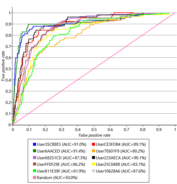
These curves look very promising – there is some variation from user to user, but all the curves are all up in the top left of the ROC plot where we want them to be. But do these plots tell us what we need to know? Given that our aim is to identify emails with particular actions (or lack of actions), we need to know two things:
- Out of all replied-to emails, what fraction do we predict will be replied to?
This is the true positive rate, which the ROC curve is already giving us on its y-axis. In this context, the true positive rate is also referred to as the recall since it measures how many of the replied to emails were successfully ‘recalled’ by the system.
- Out of emails that we predict will be replied to, what fraction actually are?
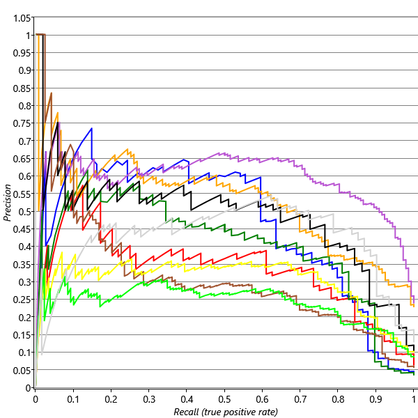
This is a new quantity called the precision and is not shown on the ROC curve. Note that this is a different meaning of the word precision to its use as a parameter describing the inverse variance of a Gaussian – it is usually clear from the context which meaning is intended. To visualise the precision we must instead use a precision-recall curve (P-R curve) which is a plot of precision on the y-axis against recall on the x-axis. Figure 4.15 shows precision-recall curves for exactly the same prediction results as for the ROC curves in Figure 4.14. For more discussion of precision and recall, see Powers [2008].
To get a summary accuracy number for a precision-recall curve, similar to the area under an ROC curve, we can compute the average precision (AP) across a range of recalls – these are shown in the legend of Figure 4.15. Precision-recall curves tend to be very noisy at the left hand end since at this point the precisions are being computed from a very small number of emails – for this reason, we compute the average precision between recalls of 0.1 and 0.9 to give a more stable and reliable accuracy metric. Omitting the right hand end of the plot as well helps correct for the reduction in average precision caused by ignoring the left hand end of the plot.
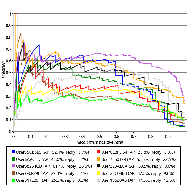
Compare the ROC and precision-recall curves – once again we can see the value of using more than one evaluation metric: the precision-recall curves tell a very different story! They show that there is quite a wide variability in the precision we are achieving for different users, and also that the users with the highest precision-recall curves (such as User68251CD) are not the same users that have the highest ROC curves (such as User6AACED). So what’s going on?
To help understand the difference, consider a classifier that predicts reply or no-reply at random. The ROC curve for such a classifier is the diagonal line labelled ‘Random’ in Figure 4.14. To plot the P-R curve for a random classifier, we need to consider that it will classify some random subset of emails as being positives, so the fraction of these that are true positives (the precision) is just the fraction of emails that the user replies to in general. So if a user replies to 20% of their emails, we would expect a random classifier to have a precision of 20%. If another user replies to 2% of their emails, we may expect a random classifier to have a precision of 2%. The fraction of emails that each of our users replies to is given in the legend of Figure 4.15, following the average precision. User68251CD replies to the highest percentage of emails 23.6% which means we might expect it to be easier to get higher precisions for that user – and indeed that user has the highest average precision, despite having an intermediate ROC curve. Conversely, User6AACED, who has one of the highest ROC curves, has only a middling P-R curve, because this user only replies to 3.2% of their email. Given that our two error metrics are giving us different information, how can we use them to assess success? How can we set target values for these metrics? The answer lies in remembering that we use metrics like AP and AUC only as a proxy for the things that we really care about – user happiness and productivity. So we need to understand how the values of our metrics map into the users’ experience of the system.
Understanding the user’s experience
Once the system is being beta tested by large numbers of users, we can use explicit feedback (for example, questionnaires) or implicit feedback (for example, how quickly people process their email or how many people turn off the feature) to assess how happy/productive users are for particular values of the evaluation metrics. During the early stages of developing the system, however, we must use our own judgement of how well the system is working on our own emails.
To understand how our evaluation metrics map into a real user’s experience, it is essential to get some users using the system as soon as possible, even if these users are just team members. To do this, we need a working end-to-end system, including a user interface, that can be used to evaluate qualitatively how well the system is performing. Having a working user interface is particularly important since the choice of user interface imposes requirements on the underlying machine learning system. For example, if emails are to be removed from a user’s inbox without giving any visual indication, then a very high precision is essential. Conversely, if emails are just to be gently de-emphasised but left in place, then a lower precision can be tolerated, which allows for a higher recall. These examples show that the user interface and the machine learning system need to be well matched to each other. The user interface should be designed carefully to tolerate any errors made by the machine learning component, whilst maximising its value to the user (see Patil [2012]). A well-designed user interface can easily make the difference between users adopting a particular machine learning system or not.
For our purposes, we need a user interface that emulates an email client but which also displays the reply prediction probability in some visual way. Figure 4.16 shows a suitable user interface created as an evaluation and debugging tool.
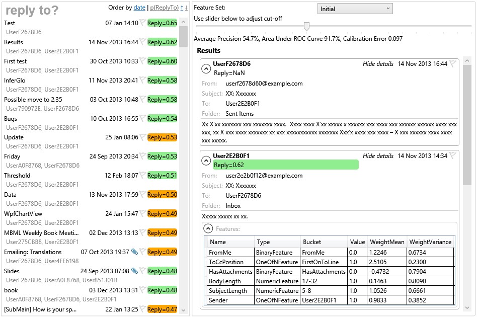
The tool has a cut-off reply probability threshold which can be adjusted by a slider – emails with predicted reply probabilities above this threshold are predicted to be replied to and all other emails are predicted as not being replied to. The tool also marks which emails were correctly classified and which were false positives or false negatives, given this cut-off threshold. The use of a threshold on the predicted probability again emphasises the importance of good calibration. If the calibration of the system is poor, or varies from user to user, then it makes it much harder to find a cut-off threshold that gives a good experience. The calibration of our predictions can be plotted and evaluated, as described in Panel 4.3.
- We often need to be able to trust the probabilities coming from the system. For example, they may be used to drive a user interface which varies with the probability of the prediction (such as only marking emails above a certain probability). Accurate probabilities are especially important if they are to be used as input to another machine learning system.
- If a machine learning system is poorly calibrated then it suggests a problem either in the model (such as an overly restrictive assumption) or in the approximate inference. Fixing this problem will not only improve calibration but also usually improve prediction accuracy as well.
We can use a calibration plot to evaluate how well-calibrated our email model is. To do this we take all the validation set predictions made for each user and divide them into bins according to the predicted probability of reply (0-10%,11-20% and so on). For each bin, we then compute the fraction of emails that were actually replied to (we discard bins with too few emails, since then this fraction would be very noisy). Finally, we plot the average of this fraction across users against the predicted probability, as shown below.
The plot also shows the line for a perfectly calibrated system, which is a diagonal line. Our system is reasonably well-calibrated (within about 0.1 of this diagonal). We can get an overall calibration metric by measuring how far we are from this diagonal using – for example, using a root-mean-squared-error (RMSE) difference, which for our system gives 0.094.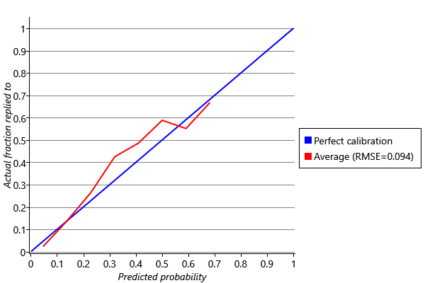
For debugging purposes, the tool shows the feature buckets that are active for each email along with the corresponding feature value and learned weight distribution. This is extremely helpful for checking that the feature computation is correct, since the original email and computed features are displayed right next to each other.
Using this tool, we can assess qualitatively how well the system is working for a particular threshold on the reply probability. Looking at a lot of different emails, we find that the system seems to be working very well, despite the apparently moderate precision. This is because a proportion of the apparent incorrect predictions are actually reasonable, such as:
- False positives where the user “responded” to the email, but not by directly replying. This could be because they responded to the sender without using email, (for example: in person, on the phone or via instant messaging) or responding by writing a fresh email to the sender or by replying to a different email.
- False positives where the user intended to reply, but forgot to or didn’t have time.
- False negatives where a user replied to an email, as a means of replying to an email earlier in the conversation thread.
- False negatives where a user replied to an email and deleted the contents/subject as a way of starting a new email to the sender.
In all four of these cases the prediction is effectively correct: in the first two cases this is an email that the user would want to reply to and in the last two it is not. The issue is that the ‘ground truth’ label that we have for the item is not correct, since whether or not a user wanted to reply to an email is assumed to be the same as whether they actually did. But in these four cases, it is not. Later in the chapter we will look at how to deal with such noisy ground truth labels.
Since the ground truth labels are used to evaluate the system, such incorrect labels can have a big detrimental effect on the measured accuracy. For example, if 25% of positive emails are incorrectly labelled as negatives, then the measured precision of a perfect classifier would be only 75% rather than 100%. If 5% of negative emails are also incorrectly labelled as positive then, for a user who replies to 10% of their emails, the recall of a perfect classifier would be just 62.5%! To see where this number came from, consider 1000 emails received by the user. The user would reply to 100 of these emails (10%) and so would not reply to 900 emails. Of the replied-to emails, only 75% (=75 emails) would be labelled positive and of the not-replied-to emails, 5% of 900 = 45 emails would be incorrectly labelled positive. So a perfect classifier would make positive predictions on 75 of the 75+45=120 emails that were labelled as positive, meaning that the measured recall would be .
However, even taking into account noisy ground truth labels, there are still a number of incorrect predictions that are genuinely wrong. Examples of these are:
- False negatives where the email is a reply to an email that the user sent, but the sender is new or not normally replied to.
- False negatives where the email is a forward, but the sender is new or not normally replied to.
- False negatives for emails to a distribution list that the user owns or manages and so is likely to reply to.
- False positives for newsletter/marketing/social network emails (sometimes known as ‘graymail’) sent directly to the user, particularly where the sender is new.
We will now look at how to modify the feature set to address some of these incorrect predictions.
Improving the feature set
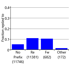
The first two kinds of incorrect prediction are false negative predictions where the email is a reply to an email from the user or a forward of an email to the user. These mistakes occur because no existing feature distinguishes between these cases and a fresh email coming from the same sender – yet if the email is a reply or forward, there is likely to be a very different reply probability. This violates Assumptions0 4.7, that is, whether the user will reply or not depends only on the feature values. To fix this issue, we need to introduce a new feature to distinguish these cases. We can detect replies and forwards, by inspecting the prefix on the subject line – whether it is “re:", “fw:", “fwd:" and so on. Figure 4.17 shows the fraction of emails replied to in the training and validation sets for known prefixes, an unknown prefix (other) or no prefix at all. The plot shows that, indeed, users are more likely to reply to messages which are replies or forwards and a SubjectPrefix feature might therefore be informative.
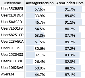
What this plot does not tell us is whether this new feature gives additional information over the features we already have in our feature set. To check whether it does, we need to evaluate the feature set with and without this new feature. Figure 4.18 gives the area under the ROC curve and the average precision for each user and averaged, for our feature set with and without the SubjectPrefix feature.
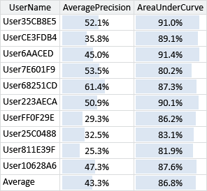
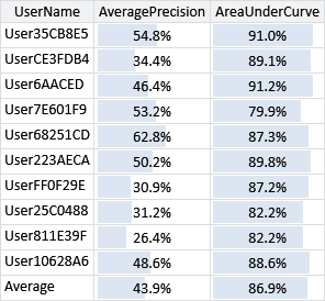
What these results show is that the new feature sometimes increases accuracy and sometimes reduces accuracy depending on the user (whichever metric you look at). However, on average the accuracy is improved with the feature, which suggests that we should retain it in the feature set. Notice that the average precision is a more sensitive metric than the area under the curve – so it is more helpful when judging a feature’s usefulness. It is also worth bearing in mind that either evaluation metric only gives an overall picture. Whilst headline accuracy numbers like these are useful, it is important to always look at the underlying predictions as well. To do this we can go back to the tool and check that adding in this feature has reduced the number of false negatives for reply/forward emails. Using the tool, we find that this is indeed the case, but also that we are now slightly more likely to get false positives for the last email of a conversation. This is because the only difference between the last email of a conversation and the previous ones is the message content, which we have limited access to through our feature set. Although incorrect, such false positives can be quite acceptable to the user, since the user interface will bring the conversation to the user’s attention, allowing them to decide whether to continue the conversation or not. So we have removed some false negatives that were quite jarring to the user at the cost of adding a smaller number of false positives that are acceptable to the user. This is a good trade-off – and also demonstrates the risk of paying too much attention to overall evaluation metrics. Here, a small increase in the evaluation metric (or even no increase at all for some users) corresponds to an improvement in user satisfaction.
The next kind of error we found were false negatives for emails received via distribution lists. In these situations, a user is likely to reply to emails received on certain distribution lists, but not on others. The challenge we face with this kind of error is that emails often have multiple recipients and, if the user is not explicitly named, it can be impossible to tell which recipients are distribution lists and which of these distribution lists contain the user. For example, if an email is sent to three different distribution lists and the user is on one of these, it may not be possible to tell which one.
To get around this problem, we can add a Recipients feature that captures all of the recipients of the email, on the grounds that one of them (at least) will correspond to the user. Again, this is helping to conform to Assumptions0 4.7 since we will no longer be ignoring a relevant signal: the identities of the email recipients. We can design this feature similarly to the Sender feature, except that multiple buckets of the feature will have non-zero values at once, one for each recipient. We have to be very careful when doing this to ensure that our new Recipients feature matches the assumptions of our model. A key assumption is the contribution of a single feature to the overall score is normally in the range -1.0 to 1.0, since the weight for a bucket normally takes values in the range and we have always used feature values of 1.0. But now if we have an email with twenty recipients, then we have twenty buckets active – if each bucket has a feature value of 1.0, then the Recipients feature would normally contribute between -20.0 to 20.0 to the overall score. To put it another way, the influence of the Recipients feature on the final prediction would be twenty times greater for an email with twenty recipients than for an email with one recipient. Intuitively this does not make sense since we really only care about the single recipient that caused the user to receive the email. Practically this would lead to the feature either dominating all the other features or being ignored depending on the number of recipients – very undesirable behaviour in either case. To rectify this situation, we can simply ensure that, no matter how many buckets of the feature are active, the sum of their feature values is always 1.0. So for an email with five recipients, five buckets are active, each with a feature value of 0.2. This solution is not perfect since there is really only one recipient that we care about and the signal from this recipient will be diluted by the presence of other recipients. A better solution would be to add in a variable to the model to identify the relevant recipient. To keep things simple, and to demonstrate the kind of compromises that arise when designing a feature set with a fixed model, we will keep the model the same and use a feature-based solution. As before, we can evaluate our system with and without this new Recipients feature.
The comparative results in Figure 4.19 are more clear-cut than the previous ones: in most cases the accuracy metrics increase with the Recipients feature added. Even where a metric does not increase, it rarely decreases by very much. On average, we are seeing a 0.2% increase in AUC and a 0.8% increase in AP. These may seem like small increases in these metrics, but they are in fact quite significant. Using the interactive tool tells us that a 1% increase in average precision gives a very noticeable improvement in the perceived accuracy of the system, especially if the change corrects particularly jarring incorrect predictions. For example, suppose a user owns a particular distribution list and replies to posts on the list frequently. Without the Recipients feature the system would likely make incorrect predictions on such emails which would be quite jarring to the user, as the owner of the distribution list. Fixing this problem by adding in the Recipients feature would substantially improve the user’s experience despite leading to only a tiny improvement in the headline AUC and AP accuracy numbers.
We are now free to go to the next problem on the list and modify the feature set to try to address it. For example, addressing the issue of ‘graymail’ emails would require a feature that looked at the content of the email – in fact a word feature works well for this task. For the project with the Exchange team, we continued to add to and refine the feature set, ensuring at each stage that the evaluation metrics were improving and that mistakes on real emails were being fixed, using the tool. Ultimately we reached the stage where the accuracy metrics were very good and the qualitative accuracy was also good. At this point you might think we were ready to deploy the system for some beta testers – but in real machine learning systems things are never that easy…
recallAnother term for the true positive rate, often used when we are trying to find rare positive items in a large data set. The recall is the proportion of these items successfully found (‘recalled’) and is therefore equal to the true positive rate.
precisionThe fraction of positive predictions that are correct. Precision is generally complementary to recall in that higher precision means lower recall and vice versa. Precision is often used as an evaluation metric in applications where the focus is on the accuracy of positive predictions. For example, in a search engine the focus is on the accuracy of the documents that are retrieved as results and so a precision metric might be used to evaluate this accuracy.
This kind of precision should not be confused with the inverse variance of a Gaussian which is also known as the precision. In practice, the two terms are used in very different contexts so confusion between the two is rare.
precision-recall curveA plot of precision against recall for a machine learning system as some parameter of the system is varied (such as the threshold on a predicted probability). Precision-recall curves are useful for assessing prediction accuracy when the probability of a positive prediction is relatively low.
The following plot shows some precision-recall curves reproduced from Figure 4.15.
average precisionThe average precision across a range of recalls in the precision-recall curve, used as a quantitative evaluation metric. This is effectively the area under the P-R curve if the full range of recalls is used. However, the very left hand end of the curve is often excluded from this average since the precision measurements are inaccurate, due to being computed from a very small number of data items.
[Powers, 2008] Powers, D. (2008). Evaluation: From Precision, Recall and F-Factor to ROC, Informedness, Markedness and Correlation. Machine Learning Technologies., 2:37–63.
[Patil, 2012] Patil, D. J. (2012). Data Jujitsu: The Art of Turning Data into Product. O’Reilly Media.
[Dawid, 1982] Dawid, A. P. (1982). The Well-Calibrated Bayesian. Journal of the American Statistical Association, 77(379):605–610.