-

Want a paper copy?
You can now buy the book!
All royalties go to the Cystic Fibrosis Trust.Spotted an error? Have comments?
Let us know!Get hands on with source code for the book.
2.4 Moving to real data
Now that we have fully tested out our model on example data, we are ready to work with some real data. We asked 22 volunteers to complete an assessment test consisting of 48 questions, intended to assess seven different development skills. Many of the questions required two skills, because they needed both the knowledge of a software development concept (such as object-oriented programming) and a knowledge of the programming language that the question used (such as C#).
As well as completing the test, we also asked each volunteer to say which development skills they consider that they have. These self-assessed skills will be used as ground truth for the skill variables – that is, we will consider them to be the true values of the variables. Such ground truth data will be used to assess the accuracy of our system in inferring the skills automatically from the volunteers’ answers. The ground truth data should be reasonably reliable since the volunteers have no incentive to exaggerate their skills: the results were kept anonymous so that the reported skills and answers could not be linked to any particular volunteer. However, it is plausible that some volunteers may over- or under-estimate their own skills and we will need to bear this in mind when using these data to assess our accuracy.
The raw data that we collected is shown in Table 2.6.
 Excel
Excel CSV
CSV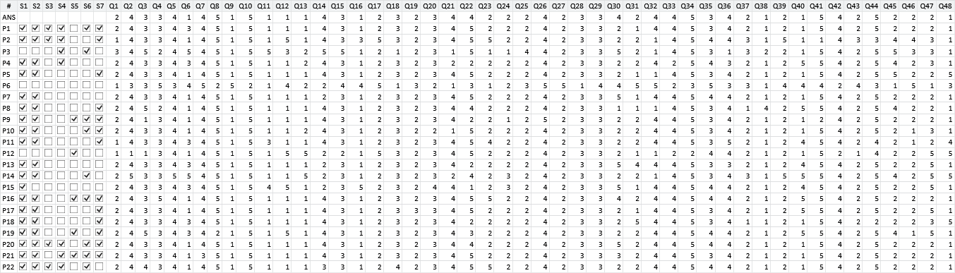
In this machine learning application, we need the system to be able to work with any test supplied to it, without having to gather new ground truth data for each new test. This means that we cannot use the ground truth data when doing inference in our model, since we will not have this kind of data in practice. Learning without using ground truth data is called unsupervised learning. We still need ground truth data when developing our system, however, since we need to evaluate how well the system works. We will evaluate it on this particular test, with the assumption that it will then work with similar accuracy on new, unseen tests.
Visualising the data
When working on a new data set it is essential to spend time looking at the data by visualising it in various ways (see Panel 2.3 for why this is so important). So let’s now look at making a visualisation of our test answers.
It is good to be creative when visualizing your data.
The crucial elements of a good visualisation are (i) it is a faithful representation of the underlying data, (ii) it makes at least one aspect of the data very clear, (iii) it stands alone (does not require any explanatory text) and (iv) it is otherwise as simple as possible. There are entire books on the topic (such as Tufte [1986]), as well as useful websites (these are constantly changing – use your search engine!) and commercial visualisation software (such as Tableau). In addition, most programming languages have visualisation and charting libraries available, particularly those languages focused on data science such as R, Python and Matlab. In this book we aim to illustrate what makes a good visualisation by example, through the various figures illustrating each case study. For example, in Table 2.4 the use of bars to represent probabilities, as well as numbers, makes it easier to see the relationship between which questions were correct and the inferred skill probabilities.
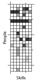
We want to visualise whether each person got each question right or wrong, along with the skills needed for that question (as provided by the person who wrote the test). For the skills needed, we can use a grid where a white square means the skill is needed and a black square means it is not needed (Figure 2.16a). Similarly for the answers, we can use another grid where white means the answer was right and black means it was wrong (Figure 2.16b). To make it easier to spot the relationship between the skills and the answers, we can align the two grids, giving the visualisation of Figure 2.16.
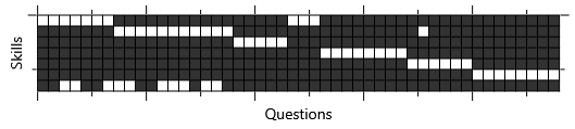
Already this visualisation is telling us a lot about the data: it lets us see which questions are easy (columns that are nearly all white) and which are hard (columns that are nearly all black). Similarly, it lets us identify individuals who are doing well or badly and gives us a sense of the variation between people. Most usefully, it shows us that people often get questions wrong in runs. In our test consecutive questions usually need similar skills, so a run of wrong questions can be explained by the lack of a corresponding skill. These runs are reassuring since this is the kind of pattern we would expect if the data followed the assumptions of our model.
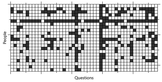
A difficulty with this visualisation is that we have to look back and forth between the two grids to discover the relationship between the answers to a question and the skills needed for a question. It is not particularly easy, for example, to identify the set of skills needed for the questions that a particular person got wrong. To address this, we could try to create a visualisation that contains the information in both of the grids. One way to do this is to associate a colour with each skill and colour the wrong answers appropriately, as shown in Figure 2.17:
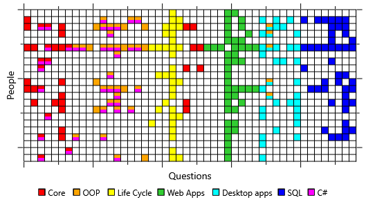
This visualisation makes it easier to spot patterns of wrong answers associated with the same skill, without constantly switching focus between two grids. We could instead have chosen to highlight the correct answers but in this case it is more useful to focus on the wrong answers since these are rarer, and so more interesting. For example, we can see that those people who got some orange (Object Oriented Programming) questions wrong often got many other orange questions wrong, since orange grid cells often appear in blocks. This is very suggestive of the absence of an underlying skill influencing the answers to all these questions. Conversely for the cyan (Desktop apps) questions there seems to be less block structure, suggesting that our assumption of one skill influencing all these questions is weaker in this case.
A factor graph for the whole test
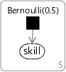
Reassured that our data looks plausible, we would now like to run inference on a factor graph for this assessment test. We’ve already seen factor graphs for three questions (Figure 2.5) and for four questions (Figure 2.14) where there were just two skills being modelled. But if we tried to draw a factor graph for all 48 questions and all seven skills in the same way, it would be huge and not particularly useful. To avoid such overly large factor graphs, we can represent repeated structure in the graph using a plate. Here is an example of using a plate used to represent the prior over five skill variables:
|
 =
=
|
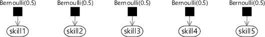
The factor graph on the left with a plate is equivalent to the factor graph on the right without a plate. The plate is shown as a rectangle with the number of repetitions in the bottom right corner – which in this case is 5. Variable and factor nodes contained in the plate are considered to be replicated 5 times. Where a variable has been replicated inside a plate it becomes a variable array of length 5 – so in this example skill is an array with elements , , , and . Note that we use index 0 to refer to the first element of an array.
|
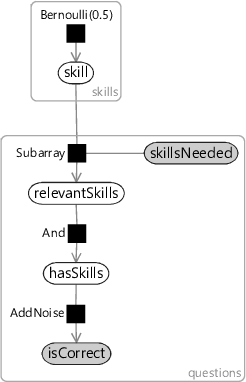
Figure 2.19 shows how we can use plates to draw a compact factor graph for the entire test. There are two plates in the graph, one across the skills and one across the questions. Instead of putting in actual numbers for the number of repetitions, we have used variables called skills and questions. This gives us a factor graph which is configurable for any number of skills and any number of questions and so could be used for any test. For our particular test, we will set skills to 7 and questions to 48.
Figure 2.19 has also introduced the Subarray factor connecting two new variables skillsNeeded and relevantSkills, both of which are arrays inside the questions plate. The skillsNeeded array must be provided (indicated by the grey shading) and contains the information of which skills are needed for each question. Each element of skillsNeeded is itself a small array of integers specifying the indices of the skills needed for that question - so for a question that needs the first and third skills this will be . The Subarray factor uses this information to pull out the relevant subarray of the skill array and put it into the corresponding element of the relevantSkills array. Continuing our example, this would mean that the element of relevantSkills would contain the subarray , . From this point on, the factor graph is as before: hasSkills is an of the elements of relevantSkills and isCorrect is then a noisy version of hasSkills.
Our first results
We are now ready to get our first results on a real data set. It’s taken a while to get here, because of the time we have spent testing out the model on small examples and visualising the data. But, by doing these tasks, we can be confident that our inference results will be meaningful from the start.
We can apply loopy belief propagation to the factor graph of Figure 2.19 separately for each person, with isCorrect set to that person’s answers. For each skill, this will give the probability that the person has that skill. Repeating this for each person leads to a matrix of results which is shown in the visualisation on the left of Figure 2.20, where the rows correspond to different people and the columns correspond to different skills. For comparison, we include the self-assessed skills for the same people on the right of the figure.

There is clearly something very wrong with these inference results! The inferred skills show little similarity to the self-assessed skills. There are a couple of people where the inferred skills seem reasonable – such as the people on the 3rd and 6th rows. However, for most people, the system has inferred that they have almost all the skills, whether they do or not. How can this happen after all our careful testing and preparation?
In fact, the first time a machine learning system is applied to real data, it is very common that the results are not as intended. The challenge is to find out what is wrong and to fix it.
ground truthA data set which includes values for variables which we want to predict or infer, used for evaluating the prediction accuracy of a model and/or for training a model. Ground truth data is usually expensive or difficult to collect and so is a valuable and scarce commodity in most machine learning projects.
unsupervised learningLearning which doesn’t use labelled (ground truth) data but instead aims to discover patterns in unlabelled data automatically, without manual guidance.
visualisationA pictorial representation of some data or inference result which allows patterns or problems to be detected, understood, communicated and acted upon. Visualisation is a very important part of machine learning, as discussed in Panel 2.3.
plateA container in a factor graph which compactly represents a number of repetitions of the contained nodes and edges. The plate is drawn as a rectangle and labelled in the bottom right hand corner with the number of repetitions. For example, see Figure 2.18.
variable arrayAn ordered collection of variables where individual variables are identified by their position in the ordering (starting at zero). For example, a variable array called skill of length 5 would contain five variables: , , , , and .
The following exercises will help embed the concepts you have learned in this section. It may help to refer back to the text or to the concept summary below.
- Create an alternative visualisation of the data set of Table 2.6 which shows which people get the most questions right and which questions the most people get right. For example, you could sort the rows and columns of Figure 2.16 or Figure 2.17. What does your new visualization show that was not apparent in the visualisations used in this section? Note: the data set can be downloaded in Excel or CSV form using the buttons by the online version of the table.
- Implement the factor graph with plates from Figure 2.19 using Infer.NET [Minka et al., 2014]. You will need to use Variable arrays,ForEach loops and the Subarray factor. Apply your factor graph to the data set and verify that you get the results shown in Figure 2.20a.
[Tufte, 1986] Tufte, E. R. (1986). The Visual Display of Quantitative Information. Graphics Press, Cheshire, CT, USA.
[Minka et al., 2014] Minka, T., Winn, J., Guiver, J., Webster, S., Zaykov, Y., Yangel, B., Spengler, A., and Bronskill, J. (2014). Infer.NET 2.6. Microsoft Research Cambridge. http://research.microsoft.com/infernet.